Flavor Branding: Tall Tales

For our final package design project, we got to work with Tall Tales Brewery in Parsonsburg, Maryland to brand two of their new flavors coming out, a fruity kettle sour called Jamm'd and a cryogenically brewed New England IPA called I'm Not Cryo You're Cryo.

For the Jamm'd kettle sour, the focus of flavors centered on strawberry, peach, and apricot. I wanted to go for an edgy, illustrative look, so I made the fruits with an illustrated aesthetic. I made the leaves at the top of the strawberry and peach pointed and flourished, to give the whole idea a sense of movement. I put them in a bulging basket to really convey the "Jamm'd" look. The banner and the chosen typeface give it an edgy, rock n' roll vibe, which I thought would appeal to the general audience that would drink this beer. The background color was chosen to accent the fruit taste depicted.

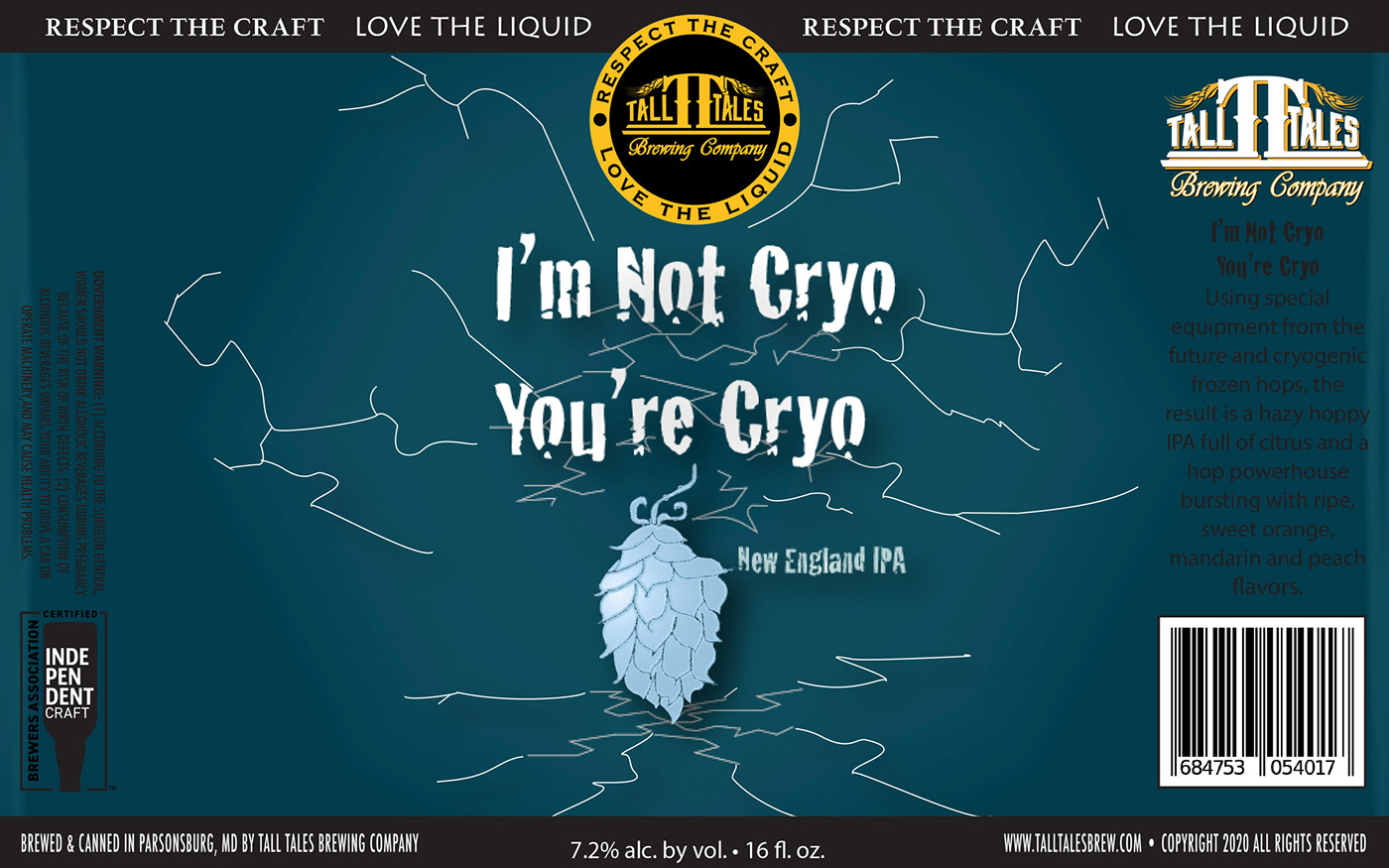
For the I'm Not Cryo You're Cryo New England IPA, I chose to depict a frozen hops plant with icy cracks against a dark blue background. The typeface was chosen because it resembled fragmented ice blocks, accentuating the cryogenically frozen hops method of this beer. I thought this illustration was simple enough to not overload the consumer with visuals, but to be engaging enough for them to see it at first glance and want to see exactly what the beer was about and how it tasted. I thought the tint of blue chosen as the background color coupled well with the light blue in the hops, the white in the typeface, and the yellow in the Tall Tales logo at the top; I thought these two striking colors as well as the accented blue color in the illustration would catch the eye of the consumer, thus drawing them in to want to to try the beer.

This is the tap handle that I designed for the I'm Not Cryo You're Cryo New England IPA. It follows the same palette of the can label. The ice cracks span almost the entire handle, and the New England IPA phrase is on the bottom.

This is the tap handle that I designed for the Jamm'd kettle sour. The design is similar to that of the can label, but to fit the more vertical plane of the handle, I made the fruit look as if they were falling into the bulging basket instead of all of them in it already.